Improving regression ceofficient plots
What does it solve?
Provides nice plotting order for coefficients/average marginal effects of primarily large multiple regression models with many categorical variables.
What are prerequisites?
library(tidyverse)Data frame that contains following variables:
full_factoroutput name of the factor fromlm(...);varname of the variable - it has to be ordered! (alphabetic~ascending);factorprobably more precise of the level, it is not used in this step since it is; possible that two same levels for two different variables exist;AMEeither average marginal effect or coefficient, numeric.
It looks something like this:
##                      full_factor                              var
## 1                            age                              Age
## 2                  immigrantTRUE                        Immigrant
## 3         polviews_mCONSERVATIVE Political views\n[ref: moderate]
## 4    polviews_mEXTREMELY LIBERAL Political views\n[ref: moderate]
## 5 polviews_mEXTRMLY CONSERVATIVE Political views\n[ref: moderate]
## 6              polviews_mLIBERAL Political views\n[ref: moderate]
##                  factor          AME
## 1        One year older -0.008072866
## 2                   Yes  0.033819800
## 3          Conservative -0.154539964
## 4      Extremly Liberal  0.376695109
## 5 Extremly Conservative -0.052852316
## 6               Liberal  0.208817771
How does it do it?
- First, some calculations:
- Creates sorting order value
n_modfor variables cording to number of models it is used in.
i.e. a reverse number of models each variable is in. Because the plot is going to be rotated, number is reversed, so the variables in the largest number of models are on the bottom. We use a simple: \((x - (max(x)+1))*(-1)\) - Creates order value
n_varbased of each variable for all applicable factors and models.
i.e. mean of all applicable estimates in one variable. - Creates order value
n_factbased on verge value of each factor estimate for all applicable models.
i.e. mean of all estimates for a factor, or level is more precise.
- Creates sorting order value
- Generates ordering vector for factors based on priority rank: (1), (2), (3).
This is achieved doing crude mathematics \(n.mod * 10000 + n.var *100 + n.fact\) (“.” instead of “_" because of formatting). And, that number is ranked and becomes the order.
- Generates ordering vector for variables to be used in faceting.
This one is slightly tricky. First, order for each variable is determined \(n.mod*10000+n.var*100\) (keeping it standardized). Then, these are extracted along with variable names, and unique values are selected, so we have a simple “key” that we use to relevel the factor in the variable. For this step, it is essential that variable variable is ordered in according to alphabet. Finally, we rotate this order when assigning it, because the plot is rotated.
It’s fairly general and can handle combined up to 99 factors and 99 variables (that can be easily be extended by adding 0 to multipliers).
Where is the code?
sort_models <- function(MDS) {
  ########  REORDERING FACTORS #######
  # Function that reorders factors in multiple models for
  # better visualisation
  # detailed description coming soon

  ## 1 # assign the number of models each factor is involved to var n_mod
  MDS$n_mod <- 0
  TMP <- MDS %>%
    group_by(full_factor) %>%
    summarise(count = n())
  TMP <- as.data.frame(TMP)
  # because plot will be rotated, reverse the numbers so the factor with most
  # models has the lowest value - thus will be on the bottom of the plot
  TMP$count <- (TMP$count - (max(TMP$count) + 1)) * (-1)
  for (i in c(1:nrow(TMP))) {
    MDS[MDS$full_factor == TMP[i, 1], "n_mod"] <- as.numeric(TMP[i, 2])
  }

  ## 3 # now order according to mean eastimator for each variable to n_var
  MDS$n_var <- 0
  TMP <- MDS %>%
    group_by(var) %>%
    summarise(mean = mean(AME))
  TMP <- data.frame(var = TMP$var, # for some reason it didn't convert from tibble
                    mean = TMP$mean)
  TMP$ordr <- rank(TMP$mean)
  for (i in c(1:nrow(TMP))) {
    MDS[MDS$var == TMP[i, 1], "n_var"] <- as.numeric(TMP[i, 3])
  }

  ## 2 # now order according to mean estimator for each factor to n_fact

  MDS$n_fact <- 0
  TMP <- MDS %>%
    group_by(full_factor) %>%
    summarise(mean = mean(AME))
  TMP <- data.frame(full_factor = TMP$full_factor,
                    mean = TMP$mean)
  # take ranking, i.e. order of each mean
  TMP$ordr <- rank(TMP$mean)
  # asign that each mean
  for (i in c(1:nrow(TMP))) {
    MDS[MDS$full_factor == TMP[i, 1], "n_fact"] <- as.numeric(TMP[i, 3])
  }

  ### ordr # CREATER ORDERING VARIABLE
  # it synthesises all the previous rankings according to priority

  MDS$ordr <- (MDS$n_mod * 10000) + (MDS$n_var * 100) + MDS$n_fact
  #MDS$ordr <- as.integer(MDS$ordr)    # this is probably unnecessary transformation
  #MDS$ordr <- as.factor(MDS$ordr)     # this too
  # this is final variable that will be used for "relevel" in ggplot
  MDS$ordr <- as.integer(rank(MDS$ordr))

  ### v_ordr # REORDER LEVELS WITHIN var VARIABLE
  # first position of each variable according to model and mean estimators
  MDS$v_ord <- (MDS$n_mod * 10000) + (MDS$n_var * 100)
  MDS$v_ord <- as.integer(MDS$v_ord)
  # reduce the repeated values
  MDS_n <- data.frame(var = MDS$var,
                      v_ord = MDS$v_ord)
  MDS_n <- unique(MDS_n)
  # sort according to alphabet (the way they are in the original DF)
  MDS_n <- MDS_n[order(MDS_n$var), ]
  # extract numeric factor for releveling of the variable factor, it has to be
  # descenting order, because plot is rotated. And relevel factor.
  reord_lev <- order(MDS_n$v_ord, decreasing = TRUE)
  MDS$var <- factor(MDS$var, levels(MDS$var)[reord_lev])
  return(MDS)
}
So, the function is called and data frame should look like this
MN <- sort_models(MN)
head(MN[, c("full_factor", "var", "factor", "ordr", "AME")])
## full_factor var
## 1 age Age
## 2 immigrantTRUE Immigrant
## 3 polviews_mCONSERVATIVE Political views\n[ref: moderate]
## 4 polviews_mEXTREMELY LIBERAL Political views\n[ref: moderate]
## 5 polviews_mEXTRMLY CONSERVATIVE Political views\n[ref: moderate]
## 6 polviews_mLIBERAL Political views\n[ref: moderate]
## factor ordr AME
## 1 One year older 23 -0.008072866
## 2 Yes 26 0.033819800
## 3 Conservative 47 -0.154539964
## 4 Extremly Liberal 52 0.376695109
## 5 Extremly Conservative 48 -0.052852316
## 6 Liberal 51 0.208817771levels(MN$var)## [1] "Religion\n[ref: mod. or lib. prot.]"
## [2] "Political views\n[ref: moderate]"
## [3] "Region\n[ref: Midwest]"
## [4] "Childhood\n[ref: medium city]"
## [5] "Education\n[ref: LT HS]"
## [6] "Parents' education"
## [7] "Income"
## [8] "Immigrant"
## [9] "Age"
## [10] "Metrop. area\n[ref: city (top 100)]"
## [11] "Veteran"
## [12] "Sex"
## [13] "Race\n[ref: white]"Within ggplot2, the order should be called in following way:
 ### Additional pre-plot formating is in repository, or will be there soon

p_m <- ggplot(data = MN, aes(x = reorder(factor, ordr),
                             y = AME,
                             ymin = lower,
                             ymax = upper,
                             colour = model,
                             alpha = sig)) +
  scale_colour_manual(values = c("#1b9e77", "#d95f02", "#7570b3"))

### The missing code for whole is in repository, or will be there soon

p_m <- p_m + facet_grid(var ~ .,
                          scales = "free_y",
                          space = "free_y",
                          switch = "y")
How do outups compare?
Without function: 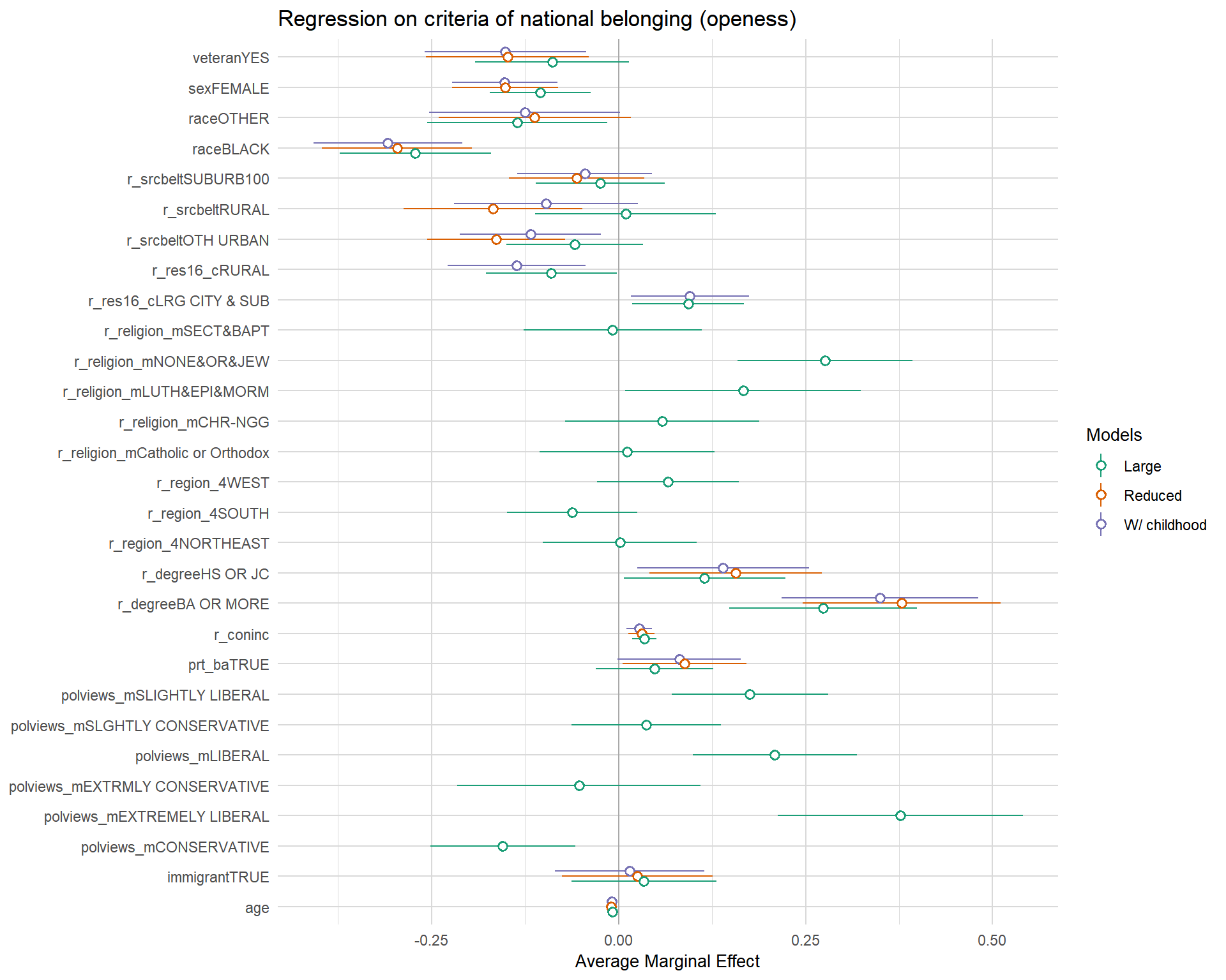
With function (and some additional few dozen of lines, but the structure is important) 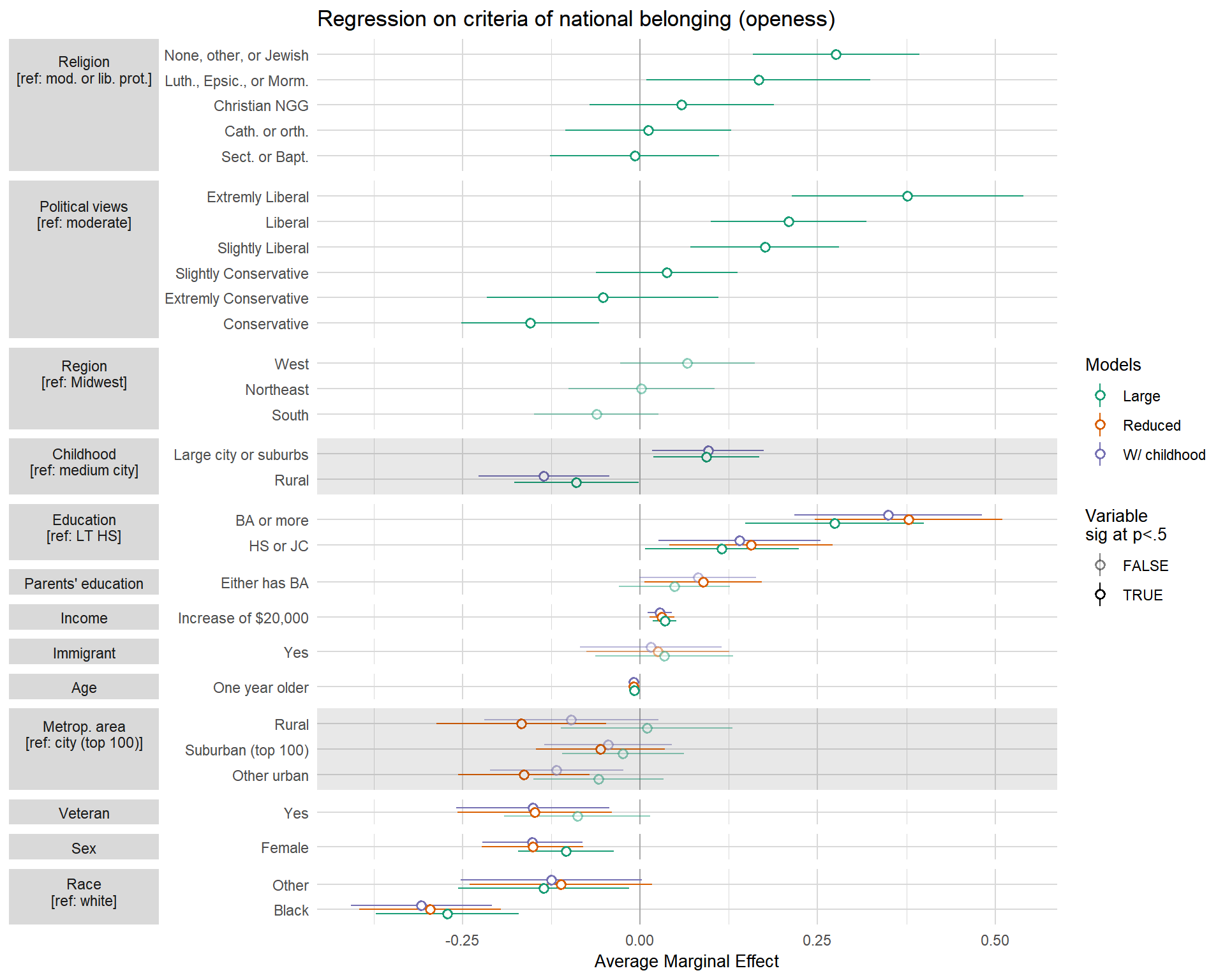
This is better/worse than this plot!
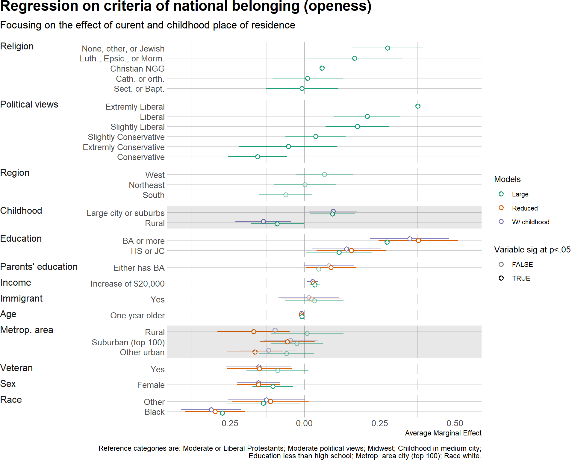
Yes, there are two (!) problems in creating perfect plot:
Labels that are used in facets can be left align or center aligned. If they are center aligned, second row can be included and it looks nice. However, if they are left (or right) aligned, the whole block of text is aligned, and then two rows are centered within that area making it completely intelligible.
This means that it is necessary for facet strips to have background so they look nice. However, using the great
hrbrmstrtheme for plotting, I couldn’t figure out how to color background of strips—it’s probably something super simple. So, I was left with these two options. Alternately, you might try to include a “fake” level with empty line, but it would require that before sorting you assign it very high value, which is later deleted. Unfortunately, if you have more than 10-15 rows of data it would probably look a bit ugly.There is also issue of renaming all the variables, so they look decent either with or without a row. I’m currently trying to figure that out, there are few ideas outlined on paper, but we will see.