Scaling thousands and millions
This one has probably even more unique/rare appliation. We don’t want to mix different “units”, and an axis that would include from 100s to 1,000,000s, well this wouldn’t be a helpful way.
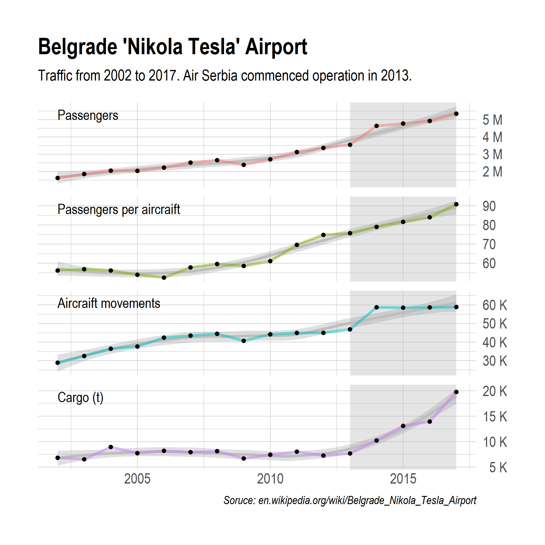
But, it solved a problem in faceting data for Belgrade Airport which included number of passengers, plane operations, cargo, and passengers per airplane to be presented in one plot with numbers formated in a clean way.
library(ggplot2)
library(scales)

imenuj <- function(x) {
  ifelse(x > 999999,
         paste(comma(x * 0.000001), "M"),
         ifelse(x > 999,
                paste(x * 0.001, "K"),
                paste(x)
                )
         )
}
Once it is included in gglpot labels option,
scale_y_continuous(labels = imenuj, position = "right")the first graph becomes the second one. Much better.